voteoswego.com
Problem
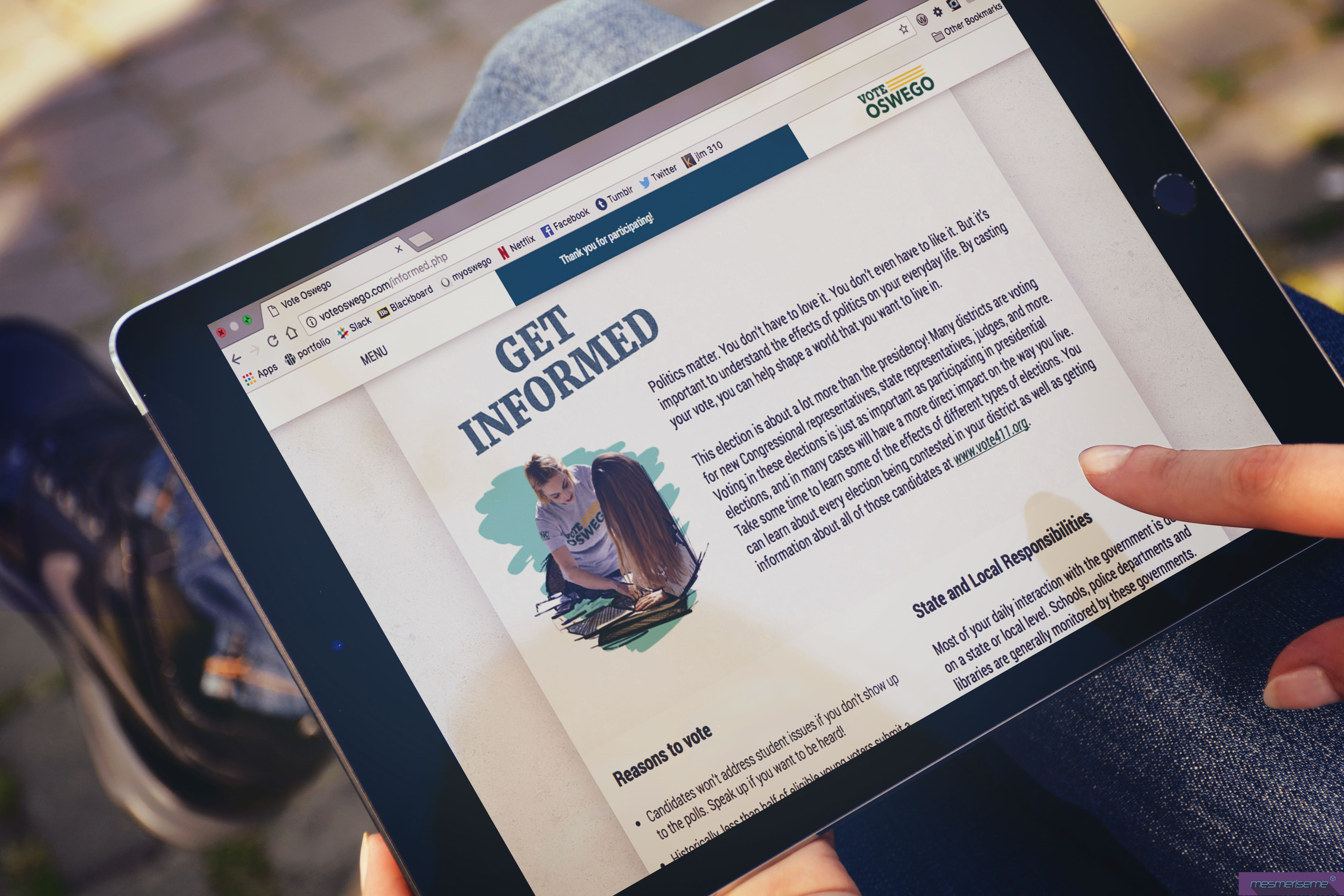
Vote Oswego is a nonpartisan voter registration campaign created on the SUNY Oswego campus during the 2016 Presidential Election. Their goal was to help make college students a bigger part of the political conversation. The Vote Oswego team wanted to increase their web presence by creating a website that was created collaboratively as a team.
Audience
The primary audience of Vote Oswego consists of students at SUNY Oswego. As a team, we divided the student population into five personas. Students who are volunteers, politically active students, students who are uninterested in voting, students who are registered, but have never voted before, and students who aren’t registered.


Information Architecture
As a team, we were tasked to read the content provided to us, and to create an information hierarchy. We split up the content by webpages and put the information in order of importance. I alongside several team members created hierarchy throughout the website, by chunking similar information together. In order to increase readability and scanning we cut out unimportant information. People often scan when there is a lot of information listed, in order to keep this from occurring it was important to take out make edits to the content.
Style Guide
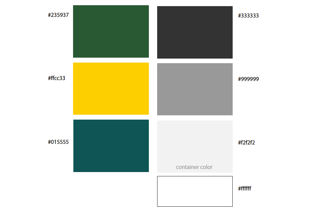
I was tasked to create a style guide alongside the visual team. The style guide had to match the visual identify Vote Oswego had previously created. Based on the Oswego green (#235937) and yellow (#ffcc33) , we needed to come up with an appropriate color scheme, typography, layout design, and decide the photo/illustration usage.
Colors
Contrast Checker

We chose the above colors because the green and yellow are a part of the college’s color scheme and were included in the original branding in the project. We also chose to include the teal because that was a color included in their social media branding. Throughout the project we had a hard time choosing colors because many of the colors compromised the contrast of one another. We resolved this problem by using the grey and white as a background color and used the other colors to add hints of color and embellishments throughout the site. This made sure that contrast and legibility didn’t become a problem on the website.
Wireframes
I was tasked with creating wireframes to figure out how visually display the content. It was important to the client that the design was responsive for all screen sizes. In order to accomplish this, I needed to make wire frames for mobile, tablet, and desktop screen sizes. On each screen content is piled differently. On mobile the website has one column, on tablet content is split into two columns, and the desktop version uses three columns. This step was important because after other team members transferred the wireframes to create visual mockups.
Coding
During the coding stage of the project, I started with creating the original HTML templates for the volunteer, informed, and home pages. After coding the HTML templates I styled the typography possibilities using the css style sheet. As the project progressed, I alongside one of my team members created flex boxes to help organize the content. Using flex boxes when creating a website, helps organize content and imagery in a functional, legible, and readable manner.

