The Children’s Board of Oswego NY, Inc. is a not-for-profit community organization that raises money and awareness for families and children in Oswego County. They put on monthly events for the community to help and to improve other people’s lives.
Problem
The Children’s Board was in need of a website and print materials redesign. Their website and current print materials were out of date and needed a more updated and contemporary version. This project was broken up into two teams, a web team and print designer. I acted as the print designer and created a brochure, post card, and business card to help improve the brand and identity of the Children’s Board.
Audience
The primary audience includes volunteers on the Children’s Board, people who want to donate to Oswego County, people who have an interest in becoming involved in the Oswego community, parents of families in Oswego County, and people who want to help an individual or family in need. Its important that the goals and expectations are met by each audience group in the printed materials.
Brand Decisions
It was decided that the brand would have a family friendly, approachable, trustworthy, and colorful mood. Based on these attributes, I worked along with the web team to create a color scheme along with a new logo that would reflect the Children’s Boards current values. It was important to the client that the logo incorporated children and was inviting to everyone. All questions about how to use the colors, logos, and type can be answered in the Children’s Board Brand Guide.

First we needed to create a color scheme that best went with the brand identity of the Children’s Board. The board wanted to have fun and bright colors to signify the fun of childhood and families getting together. In the beginning we really struggled with color, the colors we wanted to use were too bright to use with white text on top of them. As a team, we reanalyzed our approach and decided to to use brighter colors with black text on them. This made sure the text and images could be clearly seen without running into contrast issues.
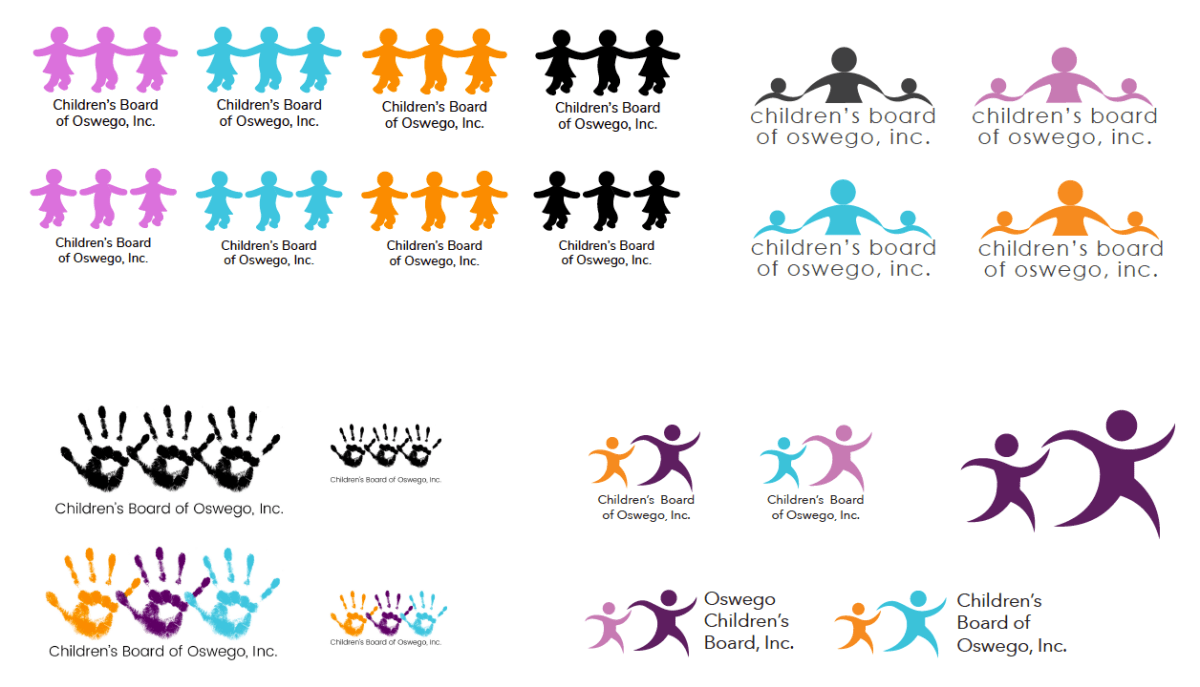
These are the logos created for the project. Each logo was created by a different team member to give the board variety. They said they wanted to create a new feeling with their logo, their original logo lacked color and resembled the logo of a business, rather then a charity for children and families. Each of these logo’s captures a different style and perspective to give the board options. The logo on the top left is a more modern and updated version of their original logo except it shares the new colors picked by the team. The logo on the top right shares a similar feeling except it is an adult holding their arms around two younger children. The bottom left logo is child oriented and represents being young and having fun. The bottom right logo is a child and adult holding hands as they are moving off the page. Each logo is unique, but says something different to the client. The client picked the top left logo, because they thought it was a logo their old members could identify with but with the new Children’s Board colors.
Brochure
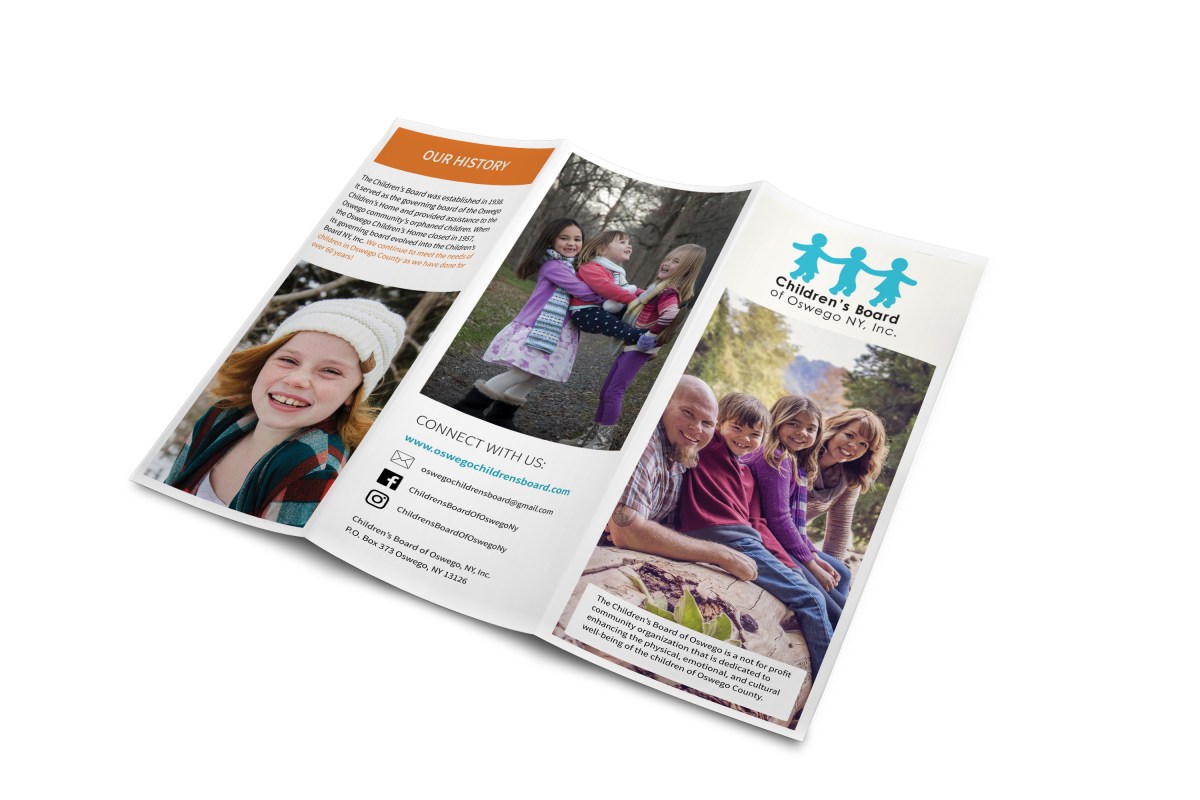

As I began to design the brochure, I started researching different not-for-profits and looking at their brochures. I chose to look at Big Brothers Big Sisters of America, St. Jude’s Children’s Research Hospital, and Make-A-Wish Foundation. I chose these companies because they have a similar mission to the Children’s Board of Oswego, NY. and have similar audience groups. I wanted to look into the way these companies appeal to their audience in order to make a plan for my own printed materials.
In the beginning of the project, I was too focused on making the printed materials and website look cohesive. I was too concentrated on the web design and tried incorporating those specific elements into the materials. However once I re-examined my designs, I came up with the final design for the brochure and other printed materials that match the Children’s Board identity. It was important to me that the print materials reflect an image based style because it would create a more personal feeling. It was vital to the client that their audience feels like they can identify and relate to the personality of the Children’s Board and that was achieved through using imagery and little amounts of text.
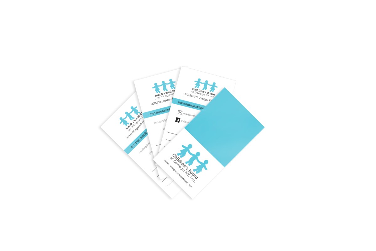
Post Card and Business Card
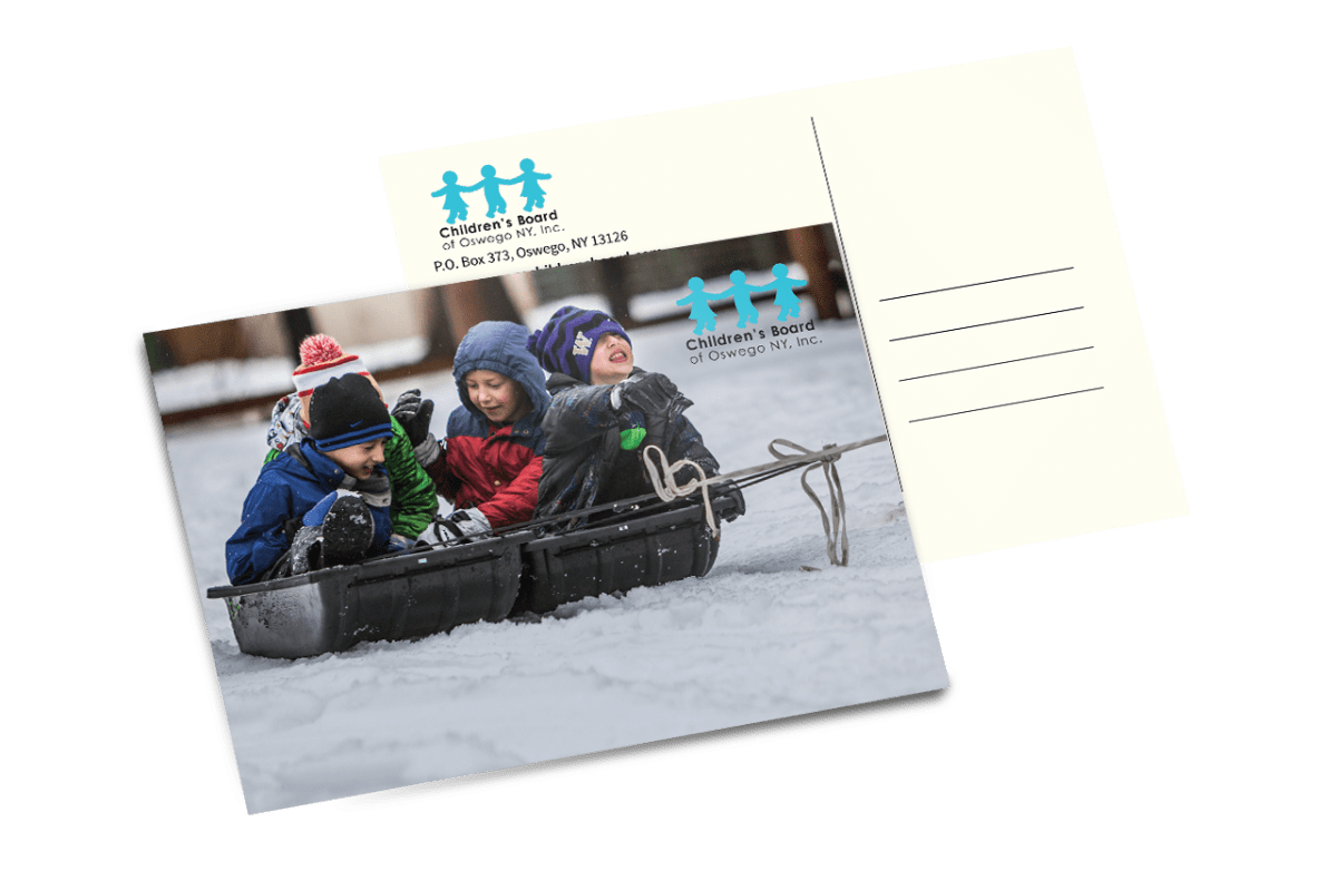
When designing the post card it was necessary that the design was cohesive to the brochure. I used several elements in each material to make certain the designs remain unified. Each printed materials incorporates the blue version of the logo and the type is set to mimic one another. Source Sans Pro is used throughout the materials with regular being used for paragraph text and semi-bold for headings. Repeating these elements in each printed material makes sure that the identity of the Children’s Board remains constant and isn’t compromised.