avventura.com
Avventura is an online magazine featuring stories and articles about traveling in Italy. I created it to construct an online environment for people looking to travel and study abroad. Avventura paves the way to information, stories, and antidotes about traveling.
Problem
No matter where you decide to go, traveling decisions always causes a major headache. Avventura is a new way to find out about traveling Italy, it shares a personal perspective that you can’t get from any traveling brochure.
Audience
Avventura’s target audience includes students studying abroad to people with a love of traveling to newbie travelers. I addressed the needs of each audience group specifically, in order to get the information they each need from the website. As I created Avventura, it was vital that I looked into the specific characteristics online magazines possess. First, I looked into magazine publications that I was familiar with, for example, Cosmo Politan, Seventeen, and Marie Claire. I chose these publications specifically because my audience includes students looking to study abroad and the demographic for these magazines focuses largely on college students. Then, I looked into travel magazines more specifically, for example, Travel and Travel Budget. I researched Travel and Travel Budget to reach my other intended audience which includes, people and families looking to travel and explore the world, I found these magazines helpful because it taught me what kinds of stories and facts people look for when planning a trip.
Online magazines and printed magazines create two uniquely different experiences and it was important to declare these differences to make the correct design decisons.
Online Magazines
- banner with magazine name
- categories to break up articles
- blockquotes
- stories are not implemented as spreads but are instead vertical
Print Magazines
- front cover with magazine name
- table of contents top break up articles
- blockquotes in the center of articles
- stories are implemented as spreads
Brand Decisions

 These colors were chosen to create Avventura. Red is the color of Italy and is vastly used throughout the country on buildings, art, and architecture. When I first started creating Avventura, I wanted blue to be my main color, blue is the color of the ocean and Italy is filled with beautiful beaches and bodies of water. Through user testing, I found that the blue was distracting and did not create the correct emotion when reading Avventura. It blended in too much to the background and didn’t allow the typography to stand out. I chose red based on user testing and vast research on Italy and other magazines. I found that users like when websites use red because it attracts their eye to the subject matter because of its high saturation and ability to stand out.
Type Choices

Puritan is typically used as a heading font and I found that it gave Avventura the style factor it needs to stand out amongst online magazines. The thick characters make it easy to read and help the individual letterforms standout.


Rasa was used as the main type throughout Avventura. Rasa is often used when there is a lot of writing and helps the content read as a publication. It has a good sense of legibility, although, through user testing, I found that certain letters can be hard to read when they are too small, the spaces in the e’s and a’s can be hard to read. I decided to make the type a little larger than typically seen on the web to alleviate this issue. This helps create a more legible font that is both easy to read and appealing to the eye.
Responsiveness
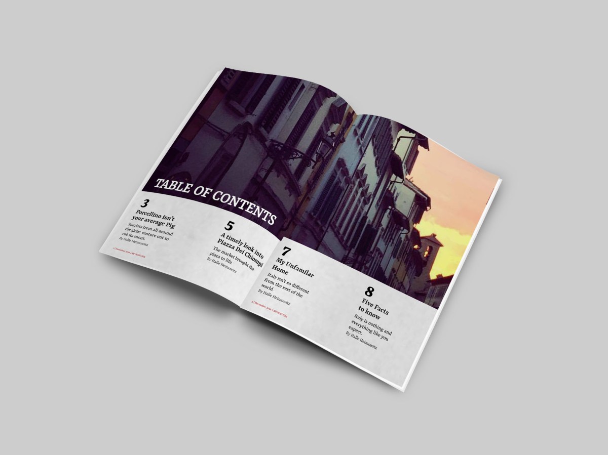
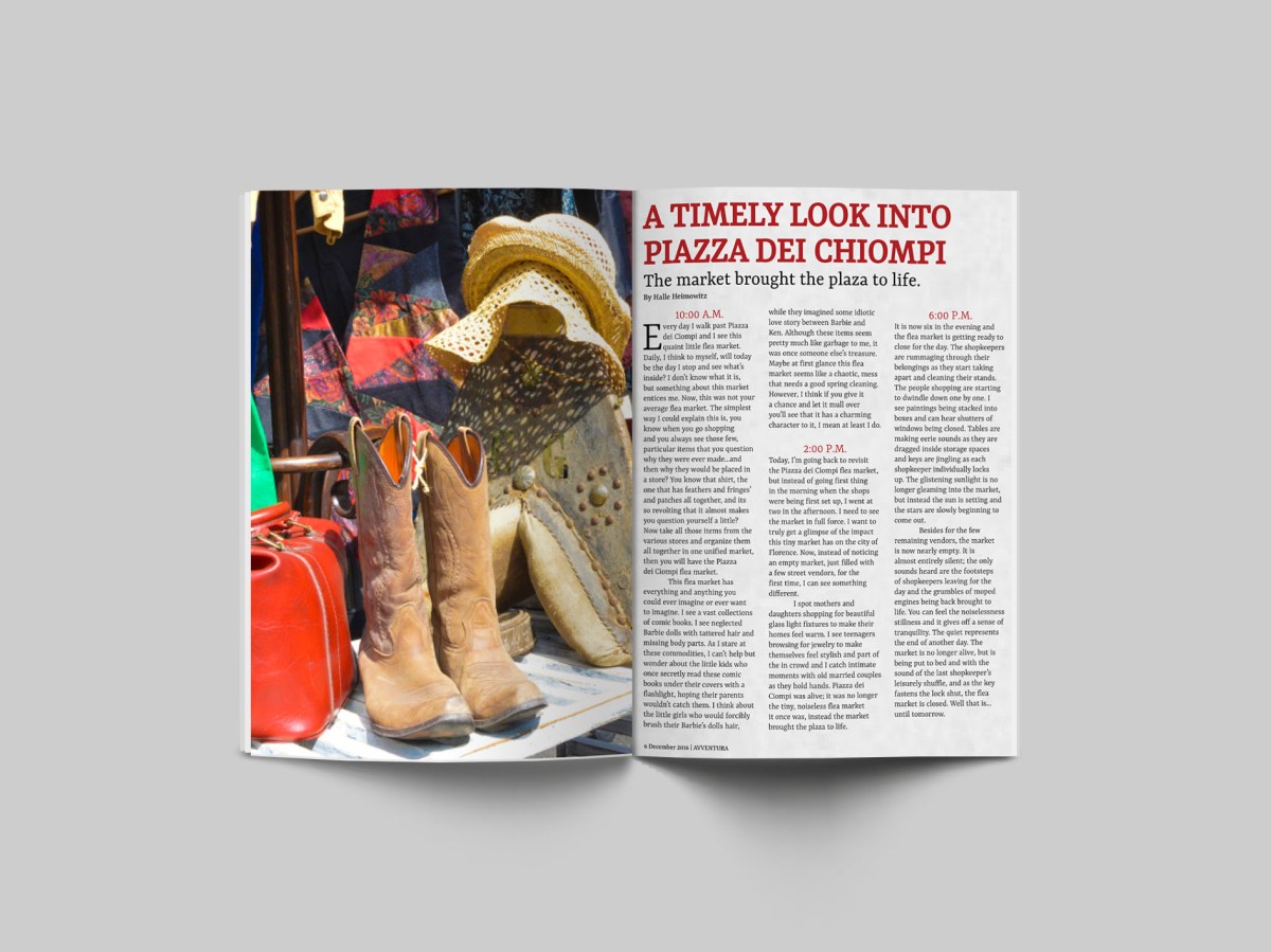
This website works across all screen sizes. As the size of the screen changes, the brand, identity and feel of the site remain the same. I paid special attention to the mobile and tablet layout of the magazine because those are the devices most users will read the magazine on. Through user testing, I found when people are reading online magazines they want to read it either on their cell phone or tablet, because if they wanted it to be larger they would buy the printed magazine instead. Users want a smaller and easier way to be able to read magazine articles when they are on the go. Also, It was important to create a printed version of Avventura in order to display the magazine physically. A printed magazine allows the audience to use it in a different manner, but is equally important. The images below display the printed issue of Avventura.


